Creating High Impact Business Reports in Excel
Summary
Regardless of the business you’re in, your data as well as the reports that contain it, are the most critical tools for decision making and communicating performance.Join us for a 90-minute, interactive instructor-led training, where you’ll discover the most vital Excel features, which will assist you with creating much more impactful, accurate and visually appealing reports.
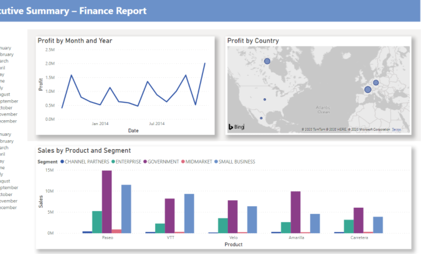
The hands-on training will focus on 3 areas - creating summary reports using Pivot Tables; creating eye-catching charts, and presenting geographic-based data with Power Map.
You’ll learn the following and more:
- Excel techniques to minimize errors, save time & impress your audience
- How to analyze critical data more effectively with key commands & formulas
- Powerful PivotTable tools to speed-up your calculations & enhance the outcome
- Easy shortcuts to create charts with a few clicks: Keys to create & customize charts
- Discover insights that wouldn’t normally “stick out”: Get started with Power Map
Objectives
Mastering Excel Charts: Keys to Creating & Modifying Charts
- How to prepare your spreadsheet and speed-up your workflow
- Keys to organizing your charts: Setting the plumbing & choosing your style
- Design tips & tricks to communicate your message & look professional
- Ways to create powerful infographics using built-in Excel functionality
Leveraging PivotTables: Expert Methods for Accurate & Efficient Reports
- How to have complete data control & include every detail you need to know
- Tools to make your data work for you: Slicers, filters & more
- PivotTable shortcuts: Automate previously dreadful analyses
- Ways to format your PivotTable reports to make effective decisions
Getting Started with Power Map: Analyze Information in New Ways
- Methods to map your data & plot TONS of data visually
- Discover how to display & analyze geographic data in 3-D
- Solutions for sharing your story: Engage your audience like never before
Program Benefits
In this 90-minute, interactive instructor-led training, you'll learn not only how to turn raw data into meaningful and useful information, but also how to present that data in a visually attractive way.
About the Speaker
Mike Thomas
"Mike Thomas has worked in the IT training business since 1989. He is a subject matter expert in a range of technologies including Microsoft Office and Apple Mac. Mike has produced nearly 200 written and video-based Excel tutorials, and... hundreds of courses and webinars on a wide variety of technology-related topics.
Mike is a Fellow of The Learning and Performance Institute and has worked with and for a large number of global and UK-based companies and organizations across a diverse range of sectors.
In addition to training, he also designs and develops Microsoft Office-based solutions that automate key business tasks and processes."
